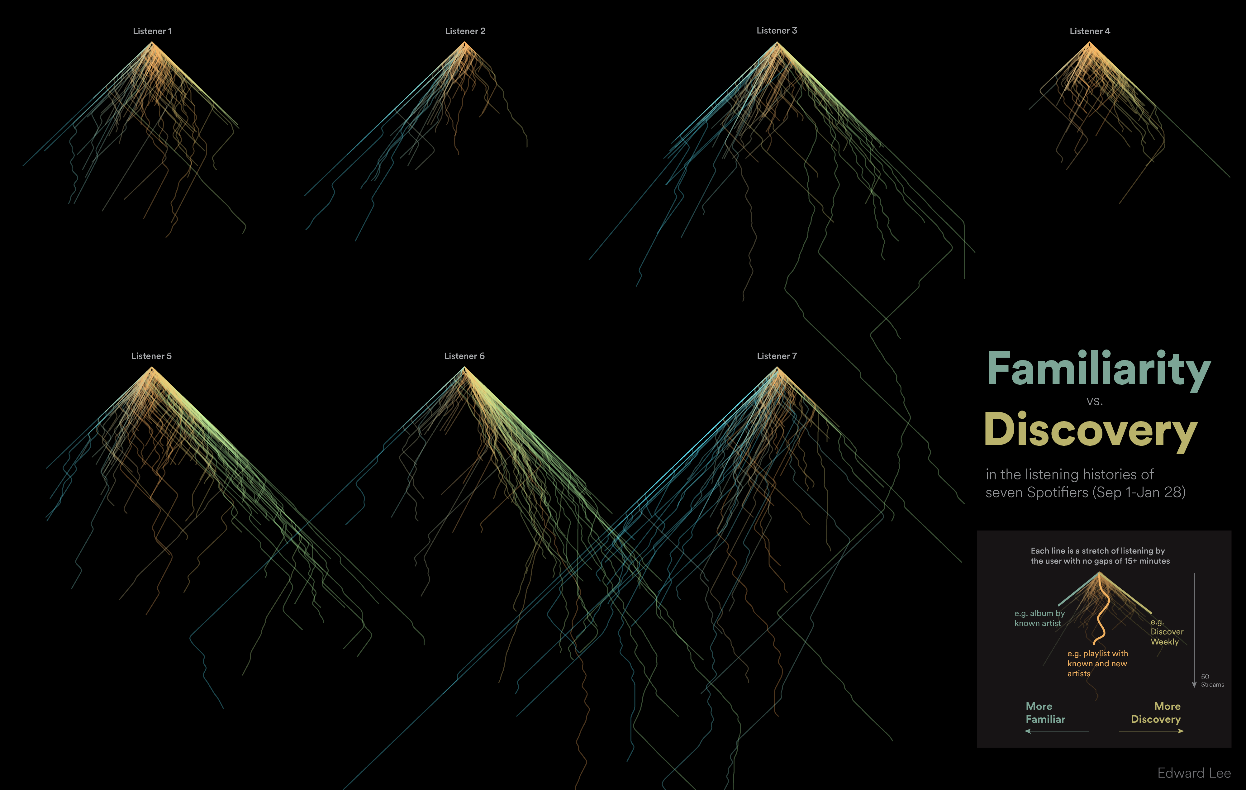
To create this project, I pulled five months of streaming data for a handful of Spotify employees (with their permission, of course). For each listener, I looked at three things: when the track was played, how long it was played, and the artist who released the track. I plotted each session along two axes: time (vertical) and discovery (horizontal). Starting from the top, the line moves down with each successive song they listen to. It steps to the left if it's a more familiar artist, and to the right if its more of a discovery. The color of each line indicates where on the spectrum it ends up by the end of the session: blue means more familiar, and green means more discovery.